The PAGE Interface
This section discusses the menus and several of the windows in the PAGE interface. Again, the PAGE interface is a modified version of the Visual Tcl interface. It was modified because some of the original facilities and features of Visual Tcl are inappropriate for PAGE or because the Visual Tcl documentation is in such a sad state that I cannot decipher them.
When PAGE is executed initially, a number of windows are spread across the screen in what may appear as random locations and sizes. I have arranged near the corners and the edges so that they will be out of the way of the GUI you are building. They should then be resized and moved to more desirable locations. Follow such placement with Main Menu selections such as Windows->Save Window Locations or File->Quit and the geometry of the windows will be saved in the .pagerc file and used when PAGE is next invoked.
Many PAGE parameters are are saved from one invocation of PAGE to the next in the file “HOME/.pagerc”. Included are the preferences and the geometry (size and location) of the various windows in the page interface as described above. This file is saved when the user does a quit.
Start PAGE by executing ‘page’ on Linux, winpage.bat in a DOS window, or activating the PAGE icon on the Windows desktop. The page and winpage.bat scripts may specify a filename. If the filename includes an extension, it must be “.tcl”; in the case of no extension or a final “.”, the extension “.tcl” will be assumed.
The default interface for PAGE presents small font sizes and the Tk default scheme of black on gray. So for my personal use I made the fonts larger and wanted the background color Wheat. See the section on Defaults and Preferences.
PAGE may be terminated with File->Quit which cleanly stops execution while saving preferences and window geometry; Control-Q also quits PAGE cleanly.
With release 4.18, most of the PAGE windows shown below have scrollbars which appear only when necessary and may be adjusted with the scroll wheel when the mouse is over the scrolled field as well as when over the scrollbar itself.
Several of the PAGE windows have a check mark in the upper right corner of the window. This mark hides the window, i.e., the window exists but is not visible on the screen. In hiding the window the contents may be applied, for example changes made in the Preferences Window will be applied. In other cases it may be nothing to apply as with the Callback Window. The windows may be mapped, or made visible, from the Main Menu.
Many of the interface images below have the background color “wheat” because I have specified that color in my color preferences.
Main Menu
The Main menu appears in the window:
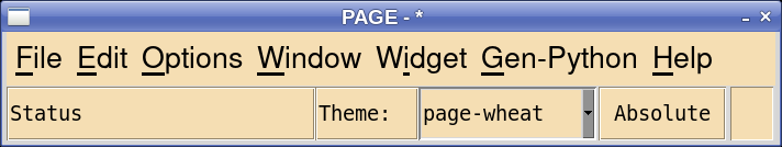
In the File submenu the Save command and the Save As… command behave a little unexpectedly. Both commands only save the current project even if there are lender GUI’s open. The Save As command always saves the current project while the Save command only saves the current project if the current project has been changed. The Borrow command is new and is described in the section on Reuse. The New command replaces the current GUI toplevel with a new toplevel Giving the user the option of saving the old one if it contains changes.
In OS X the menubar does not appear in the main window; instead it appears in the menubar at the top of the screen.
Menus
The main menu of PAGE contains some of the usual stuff and there is nothing too surprising in the File, or Edit.
A couple of points about the Window submenu that helps. There are several PAGE windows which appear for various functions and the user can relocate them, hide and retrieve them, and change their sizes and location. The selections above the separator causes the respective windows to appear at their default co-ordinates. This can be helpful when using multiple displays and then going back to a single display.
The Save Window Locations item in the Window menu saves the current locations for future invocations of PAGE. Quitting PAGE does also saves the current window locations.
The Widget menu is a context menu, a popup menu, providing functions depending on the widget selected. The popup menu is activated by selecting a widget from either the GUI window or the Widget Tree with Button-3. It allows the invocation of things like the Menu editor, or Page editor for the TNotebook widget. It also allows the user to do stuff like cut, copy, paste, and delete the widget. A new facility in 4.8 is to expand a widget to fill its container. Finally, it opens the Binding Editor. The top element of the popup menu selects a submenu containing commands appropriate to the widget.
The Widget popup appears below:

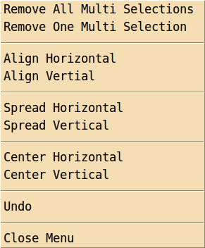
An alternate popup is associated with multi-select widgets:
The Gen_Python menu creates the Python code for the GUI module as well as the supporting module. It also loads existing modules into Python Console windows or into a user specified IDE.
Finally, the Help menu opens an About window containing some information about PAGE and can open the html version of the this documentation in the default browser. This has been tested in Linux with Firefox and Chrome, in OSX with Firefox and Safari, and XP with Firefox (I don’t have a reasonable version of IE).
Let me emphasize that PAGE will contain bugs. So be sure to save often. That is a purpose of the save commands in the File menu.
Many of interface elements like the Widget Toolbar, the Attribute Editor, and the Widget Tree can be turned on from the Window item of the main toolbar. Others are invoked from the widget menu after a widget is selected.
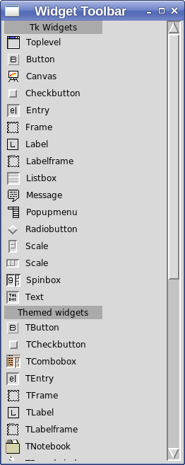
Widget Toolbar
The Widget Toolbar is where one obtains widgets for inclusion in the GUI. One begins building a GUI by selecting Toplevel with Button-1 and a blank toplevel window appears on the screen. To add widgets to the toplevel, click on the widget in the toolbar and then click in the parent. The upper left hand corner of the widget appears at the spot where the user clicked.
The Widget Toolbar appears below:
Attribute Editor
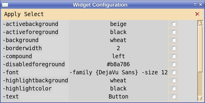
When one selects a widget the Attribute Editor displays all attributes of that widget and allows the user to modify those widgets. Each attribute row of the attribute editor has three components - a label, a modifiable field, and a check button. The plum colored fields are not modifiable, the others are. Image fields have orange backgrounds. They can be modified but generally don’t. The image field contains an image name generated from the file name and may be longer than the entry field can accommodate and I wanted a way for the user to inspect the name so I had to make it enabled. If you change it manually you will get an error message and will have fix things by re-selecting an image. The one case where it is OK to modify the image entry is to clear the field which has the effect of remove the image.
When changing an entry field, the new value is entered by hitting the Enter key or leaving the entry field. If the attribute is will become a Python variable in the generated code, a check is made to determine if it is a legal Python identifier. And of course, Unicode characters are accepted.
Text attributes presented a real challange. When a textvariable attribute is defined it is no longer possible to change the text attribute and due to an annomally in the implementation of ttk widgets the text field is set to zero length and that can make the widget invisible. The only gymnastics I could devise to make things work reasonably was to accept the artifact of “::vTcl::” appearing in the entry field for a variable. You can completely ignore it when present. You can change the variable by erasing the whole field and just entering the new value.
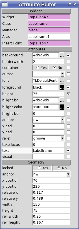
The Alias field is writable by the user. The user can provide an alias to improve the readability of the generated code. Actually, the alias field is used as the class name of the widget in the generated code and following accepted Python conventions should be capitalized.
The label on the left of an attribute is actually a label widget which may be selected with Button-3 causing a popup menu to appear allowing one to reset that attribute to the default value or to apply its current value to other widgets in the GUI. For instance, one can reset the default value of an attribute for the selected widget, all widgets of the same class in the same toplevel, or all widgets of the same class in the same container widget. Similarly, one can propagate the value of an attribute of the current widget to others of the same class. Starting with version 5.1, one can propagate an attribute to multiple selection widgets.
Invoking the popup menu, posts a menu which uses a submenu. If the Attribute Editor is close to the right edge of the screen the submenu over laps the menu and it may be confusing.
When the user modifies the width of the Attribute Editor using the mouse the content is unchanged until a different widget is selected. Then the contents will occupy the full width of the editor with appropriate scrollbars.
Widget Tree
The Widget Tree shows all of widgets created by PAGE and how they are nested within their parent widgets, see below. The labels in the tree show the widget class as well as the program alias used in the generated Python code. If a widget is inside a Plum colored rectangle, that indicates that the widget is part of the “borrowed” project. See Borrowing Widgets from Existing Projects.
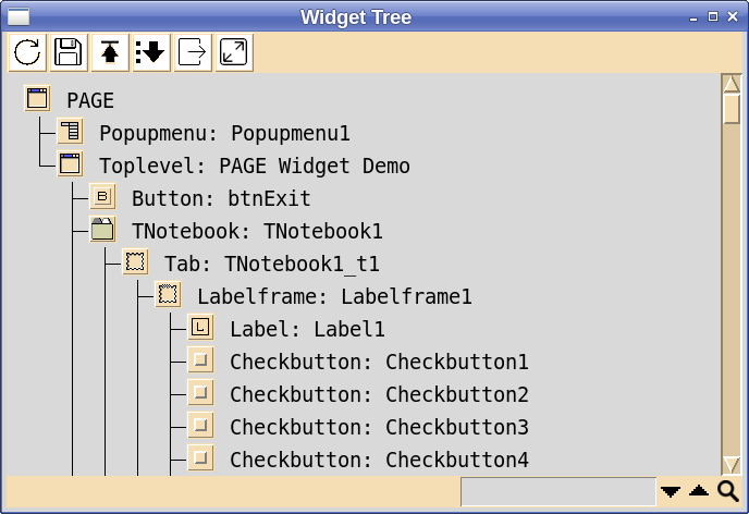
The Widget Tree is a very convenient place to select a widget with Button-1 especially for selecting widgets within more complex widgets like TNotebooks. I frequently use this window to select the widget I^^notebook want to modify and occasionally it fails to select the widget, particularly when doing copy and paste operations. For unknown reasons, if I go and select another widget and then reselect the widget I want, it usually works.
When you make a change which should appear in the Widget Tree, the Widget tree may not be updated until you hit the update button in the upper left of the Widget Tree. The number of such cases has been reduced.
The “Unselect MS” item in the menu is associated with the multiple selection function, see multipleselection; it deselects the multiple selection.
The “Close Borrowed” item in the menu closes all windows of borrowed projects.
As described below in the section Using PAGE, the Widget Tree is very important when trying to move or select some of the more complex widgets like paned windows or scrolled windows.
The Widget Tree can be saved as a text file from the Window submenu of the Main menu bar or by the Alt-f keyboard shortcut. The default file type is “.tre” (not “.tree” thanks to Windows).
Widget Tree Search
A first attempt at implementing a search function in the Widget Tree has been implemented. A search entry and search button have been added at the bottom of the Widget Tree. To do a search you may enter an expression and the search will be performed when the return key is pressed and released. All entries will be highlighted and the first will be visible. The search can also be activated by selecting the Search button.
The search entry may be either a simple string of characters or a Tcl regular expression. The search is not case sensitive.
I hope to extend this function in future releases.
Widget Tree Pruning
There are times when the Widget Tree presents an overload of widgets and it would be helpful if the presentation could be pruned. For example if the GUI contained multiple toplevel windows and you want to you want to consecrate on just one. Another example might be a TNotebook widget which contain several pages each with multiple widgets and you would like to remove the display of the other pages.
Pruning can be done by selecting the container widget you would like to collapse with Shift-Button-1. All that will be displayed is the container widget followed by the notation “(shell)” to indicate that there are unseen widgets. A pruned container can be restored to full display by once again selecting the widget with Shift-Button-1. More than one container widget may pruned. All pruned containers can be restored by selecting the “expand” button at the top of the Widget Tree.
Widget Tree Operations
Button |
Operation |
|---|---|
B1 |
Select widget. |
Shift-B1 |
Compress/expand display of container widget. |
Double-B1 |
Special command (see above table). |
B2 |
Add/remove widget to multiple selection set. |
B3 |
Open Context menu. |
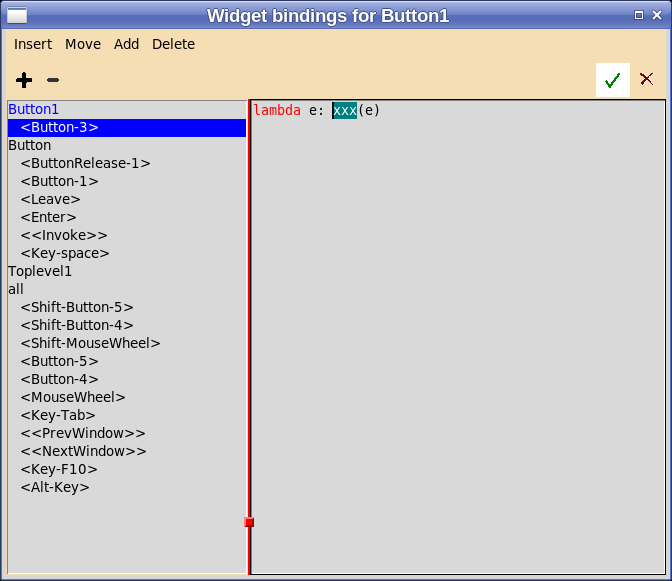
Bindings Window
This window which appears when Bindings is selected from the Widget menu allows one to add an event one of the possible bindings shown for the widget and to specify the associated action. In the image below the event <Button-2> has been added for a Button widget and “button_handler2” is specified for the action.
Menu Editor
This window easily builds and edits all menus. You can see below an example of its use.
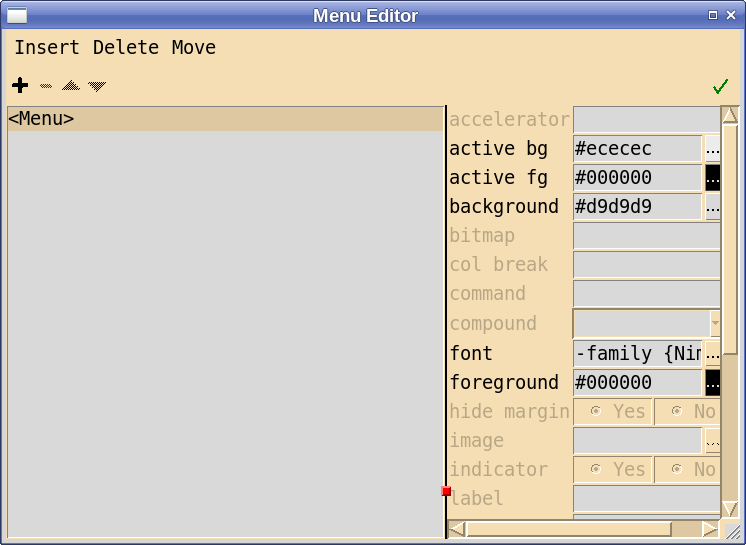
The Menu Editor can invoked by double clicking on the widget or the widget entry in the Widget. In the case of menubars it can also be invoked from the menu attribute in the Attribute Editor.
The Menu Editor displays certain entry fields with an ‘orange’ background. Such fields may be modified but should not be unless you really know what you are doing. The image attribute displays the entry field as orange and should not be changed with the exception that clearing the field will remove the image from that menu item. This is the only way I have found to remove an image from a menu entry.
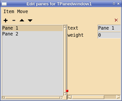
Panedwindow Editor
This editor allows the user to add panes to a TPanedwindow widget and to specify the labels for the labelframe which fills the pane. Below is an image of the editor:
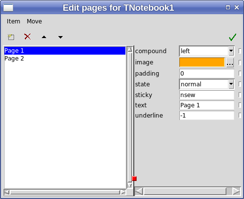
Notebook Tab Editor
This editor allows the user to add panes to a TNotebook or PNotebook widget and to specify the labels for the labelframe which fills the pane. Below is an image of the editor:
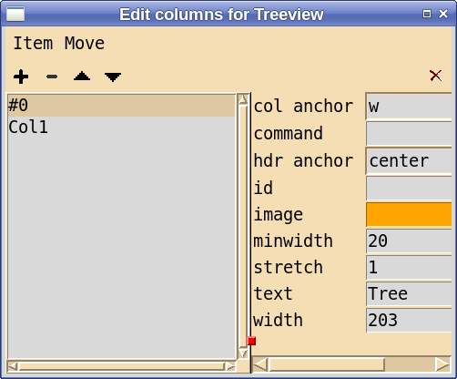
Treeview Editor
This editor allows one create, rearrange, and set attributes of columns of the Scrolledtreview widgets. One confusing aspect of treeview widgets is that both columns and headers have anchor attributes and they are distinguished in the editor as “col anchor” and “hdr anchor”.
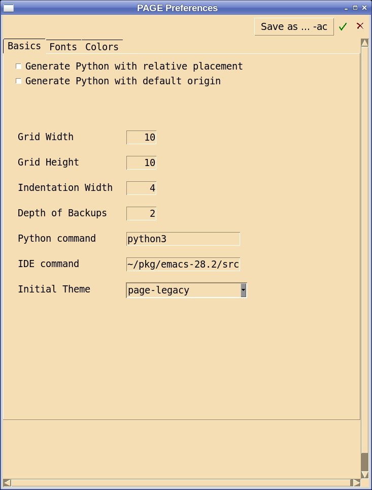
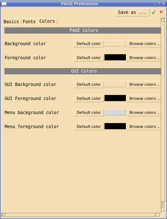
Preferences Window
The Preferences Window allows one to set some PAGE preferences. I considered removing the Preferences Window completely, but on further thought I realized that the this is indeed a complex subject involving preferences for both PAGE and the GUI generated by page. Please see the section on Defaults and Preferences.
The Basics tab of the Preferences Window is shown below:
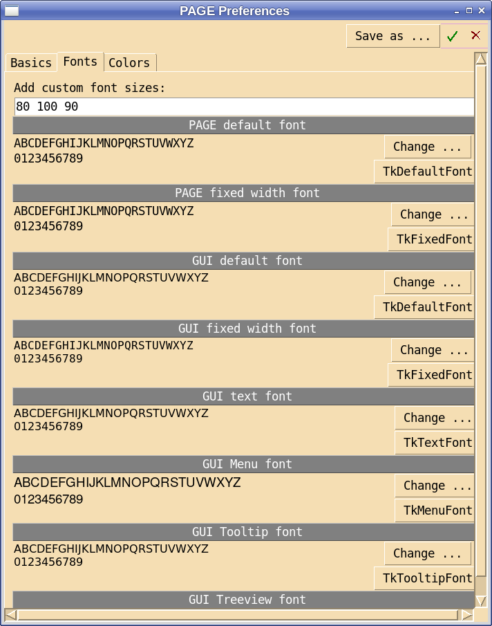
The Fonts tab of the Preferences Window is shown below:
The Colors tab of the Preferences Window is shown below:
In version 4.6, the IDE entry command has been added to support the new function of opening the users favorite IDE with stored versions of the GUI and support modules.
Python Console
When the user generates Python for either the GUI module or the support module as described above, a separate Python Console window appears with the generated code inside the upper text box. Thus one can see both the GUI module and the support module side by side as of version 4.6.
The Python Console has the following appearance:
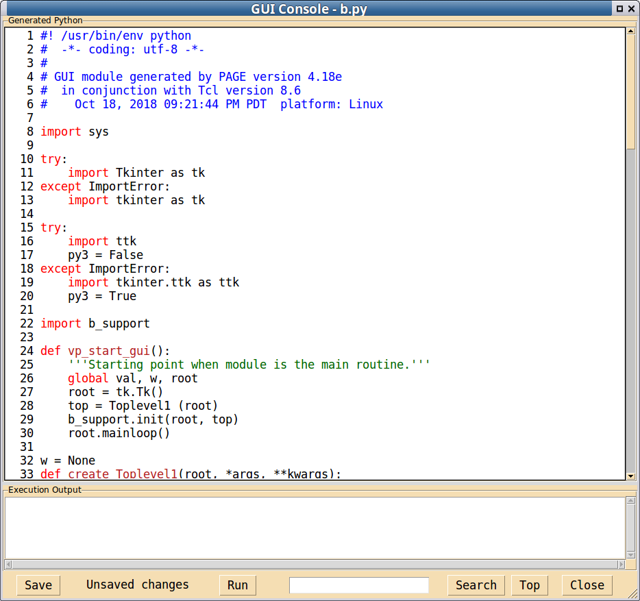
The upper text box, called the source window, contains the generated text with a bit of colorization applied; it is editable. The lower text box contains any generated output from running the source program. The Python Console is a ttk::panedwindow which allows one to move the sash between the two text boxes.
Note that upper text widget has a certain editing capability but I do not recommend it as a Python editor. See the tcl documentation for the text widget. It is meant for displaying code. If you use it as an editor you may run into difficulties. In release 4.18 line numbers were added to the console window and the searching includes the line numbers as well as the code text. Searching is initiated by either selecting the Search button or using the Return key in the search entry field.
To execute the generated Python module, just click on the Run button of the ‘Python console’. Unless you have written the necessary functions not much will happen other than providing a preview of the GUI. The skeletal functions that are generated automatically for callbacks displays the function name and any arguments in the Execution Output window On Linux or OS X that display appears immediately in the execution window; on Windows, when execution is terminated. As explained in the Rework section, the GUI module will not execute unless there is a existing support module. If the GUI code has been modified to include new callbacks then one shouldn’t expect the GUI code to execute until those callbacks have been incorporated in the support module.
There are several buttons along the bottom of the window. They behave as follows:
Save - Saves the contents of the upper text box into a file. It also saves the tcl file.
Run - Attempts to execute the GUI source module even if the displayed code is the Python support module. It also may save the Python and the tcl file. The shortcut for run is <Control-r>.
Search - Searches the source code for the regular expression in the entry field to the left. The first search starts at the top of the console and subsequent searches start where the last left off.
Top - Points the index to the top of the windows so that the next search will start at the top of the console.
Close - Closes the Python console. The shortcut is <Control-w>.
The bottom frame of the Python console also includes a label between the Save button and the Run button that will contain a warning, “Unsaved changes”, when the PAGE detects a change to the source window since the console was loaded and last saved. The warning is displayed when Python code is generated or when the source window is edited. The change detection scheme was changed in version 4.18 in the hope that fewer false positive indications would occur.
The upper text box can be modified (edited) by selecting a character position, called the insert cursor, with the mouse and typing. Such changes will be saved with either the Save button or the Run button in the GUI console. While the Generate Python window is a text widget with some editing capability, including the use control-x, control-c, and control-v for cut, copy, and paste operations. The tcl text widget has an amazing capabilities for editing but I believe the modification of generated Python code is best done in a real IDE.
As you can imagine, the colorization is not fancy. Keywords, comments, and strings are set to distinct colors. The defaults are set to reasonable colors for light backgrounds.
The Run Button attempts a trial run on your GUI. If you have enough skeleton functions in the support module and there are no errors in the generated code, you should see the python code executed and the GUI window will appear. From there you close the Python window go back to PAGE and refine the GUI by moving widgets around, adding additional widgets, or changing attributes.
With version 4.13, a search function for the upper window was added. To utilize, enter a regular expression pattern into the entry widget to the left of the Search button and select the search button or the return key in the entry widget. If the search is successful the string found will be highlighted as above and the insert cursor will be placed to the immediate right of the found string allowing successive searches. If an insert cursor is not placed in the upper window the search starts at the beginning of the window. The regular expression is a Tcl regular expression because PAGE is written in Tcl and every implementation of regular expression seems to have subtle differences
Also, scroll wheel support in the Python console works. To use the scroll wheel in Windows one must focus on the desired pane first. Finally, when the Python Console is in focus, Control-P and Control-U will have the effect of generating the GUI module and the supporting module respectively.
Execution of the python module on Linux communicates with the console through pipes; thus output from the execution now appears immediately in the Execution Output pane. Coupled with a recent change which embeds a print statement in the generated dummy functions, if a user specifies a command for a button, for example, and generates the python and runs it from the Python Console, and selects the button, the name of the command will appear in the Execution Console. This is useful because no output from selecting the widget means that you have not defined a callback function. Unfortunately, on Windows the this output does not appear until the execution terminates. (I have not been able to get Tcl pipes to work with Windows. I would appreciate help or suggestions.)
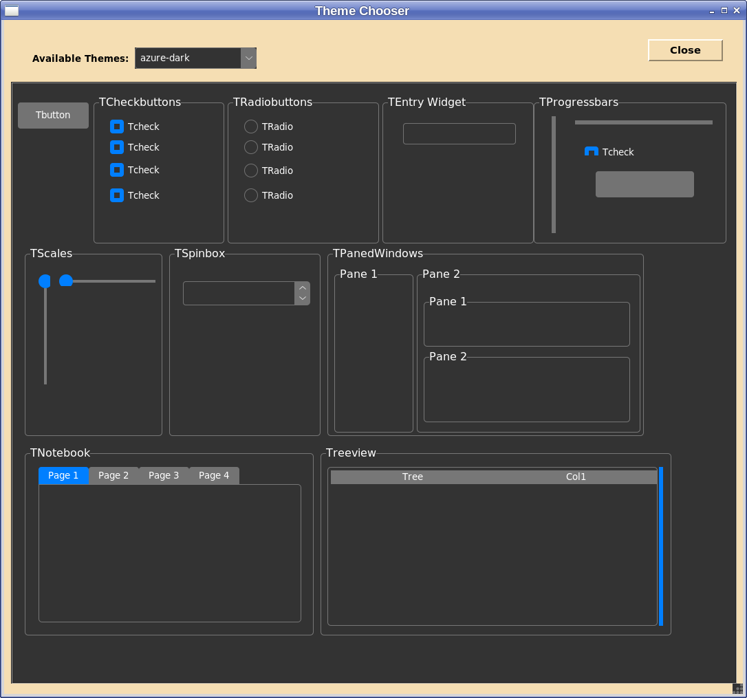
Theme Chooser
The Theme Chooser displays the themes supported by PAGE and invokes the theme displayed. So if you select a theme different than the current theme you will see how that changes the GUI under development. It does not affect PAGE windows
Callback Window
The Callback Window shows callbacks which have been defined for elements of the GUI. One may show all of the callbacks defined by selecting Window->Show All Bindings from the main menu or just the bindings for a particular widget by selecting “Callbacks…” from the Widget popup menu described above.
By double clicking on a callback, the function may be seen in the Support Console. When invoked this action attempts to load the console from the support module on disk. If the support module exists and the GUI has been changed (using a test that errs on the side of false positives) a warning message is given.
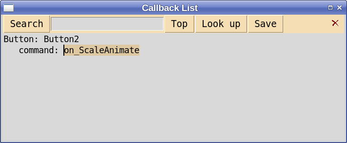
In release 4.17, the content of the Callback Window could be either saved or copied to the clipboard by means of the buttons and the check button closes the window. I have since been thinking that was unnecessary function and removed it in 4.18. Unnecessary because the content of the entire data window can be selected and pasted into an editor. If there is strong disagreement, I can reinstate that function. Let me know what you think.
The contents of the window can be searched for the regular expression from the entry field by hitting return key in the entry field or by selecting the search button. Searching is from the previous search or the top of the window for the first search. If the search is successful the matching string is made the selection. The “Look up” button will then find the callback function in the Support Console. The Top button sends the focus to the top of the window. The function of “Look up” can be initiated with Button-3 over the main window.
Apply Window
When the user stashes attribute values for the selected widget, this window opens and allows one to select the attributes to propagate using the checkboxes and then to do the actual propagation from the “Apply” submenu.
Color Dialog
There are many cases where when setting preferences in the Preferences window or attributes for a widget in the Attribute Editor one selects a little button with an ellipsis and the invokes a color dialog window:
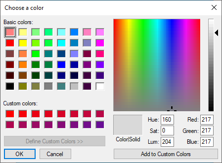
in Windows or
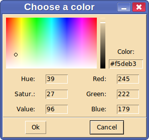
in other OS’s.
When this window pops up you are given several different ways of selecting a color:
Pick a color in the multicolored window with your mouse.
Enter values in the Red, Green, and Blue entry fields.
Enter an Hex color value such as #f5deb3 in the Color entry field. That is the color wheat.
Enter a color name such as “wheat” in the Color entry field.
Dual Monitors
One user reported a problem involving dual monitors where he had opened PAGE with dual monitors set up with the second monitor to the right of the main monitor. He then dragged one of the PAGE windows to the monitor on the right. Later he disconnected the second monitor and reopened PAGE and was unable to see the window displayed on the nonexistent monitor. This can now be rescued by selecting the appropriate window from Main menu -> Window. I would appreciate any information from users using Dual monitors.