Menus
PAGE supports menubars, menubuttons, and context menus, also called popup menus, and provides a Menu Editor for creating and modifying them. Menubars are obviously associated with particular toplevel. So are popup menus which allows projects having multiple windows to have popup menus without the worry of name clashes.
The appearance of a popup menu occurs as the action of an event associated with a widget. That action is selection with Button-3. Of course, that binding is specified using the Bindings Window.
There is a Menu Editor which facilitates the creation and modification of all the menus for PAGE.
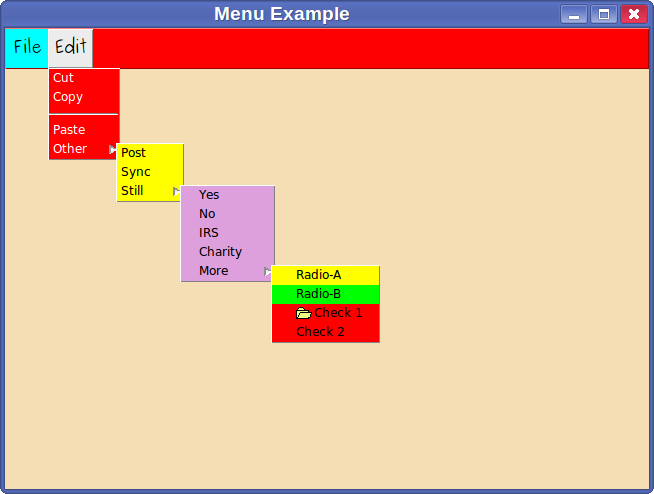
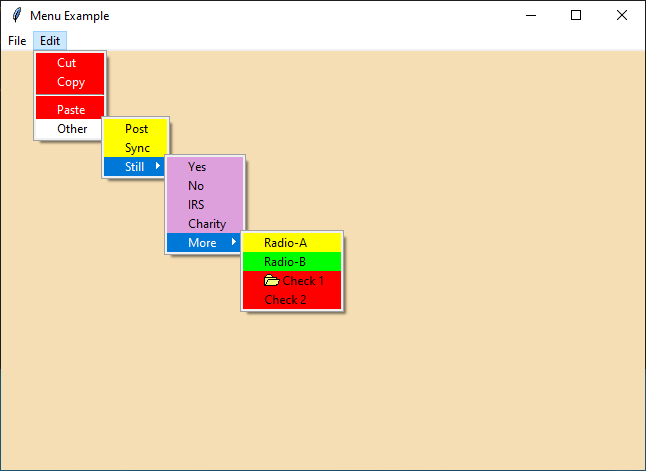
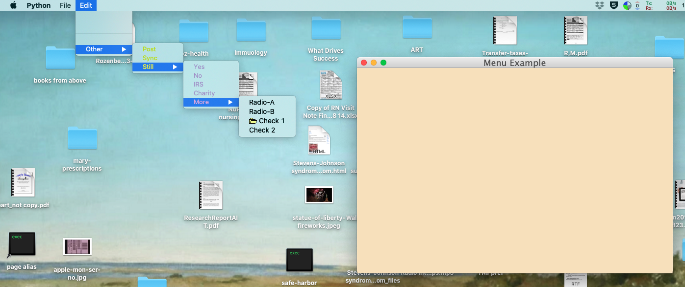
Menu bar appearance in OS X differs from that in Windows and Linux - no surprise. The differences are illustrated below:
In Linux and Windows menubars appear at the top of the associated toplevel widget. With OS X they appear at the top of the screen.
In Linux and Windows menubars may contain commands as well as submenu or cascade entries, whereas in OS X the menubar at the top of the screen appears to only display cascade entries.
With Linux one can specify fonts and colors; in Windows, colors; in OS X your stuck with OS X choices.
Let’s illustrate some differences using the menu example. See Menus
Linux:
Windows:
OS X:
I have seen numerous style recommendations that all endorse having only cascade submenus in menubars in as enforced in OS X. It is important to remember the differences among the OS’s if one develops applications to run across different OS’s. It’s a case where the tail is wagging the dog.
Menu Attributes
Menu entries have color and font attributes and there are defaults for them and the attributes can be changed in the Menu Editor. Let us consider the way menu attributes are handled in Linux because that is the most general case. You can see in the Linux example above that there are different fonts and colors available.
Tk and so tkinter define default background colors, an unappetizing gray, and a tiny font, TkMenuFont. With the Preference window (opened from the Main menu: File -> Preferences…) one can specify default foreground and background colors as well as a font for the menus which will override the Tk defaults and apply to all menu entries.
When one creates a menu using the Menu Editor a menu widget is created with the default attributes. One could expect any changed attributes in the top menu to apply as defaults to all subsequent entries in the entire menu, at least I did. However, that is not the case, those attributes apply only to the entries directly created under that menu. If you add cascade entries the cascade creates a new menu entry with the same defaults discussed in the preceding paragraph. For example, if you want all of the entries in the complete menu tree to have a background color different from the defaults, you have to change the background color for each of the submenu menu widgets, i.e. the <menu> items in the Menu Editor.
The crucial sentence in the official Tk man page for the menu entry option background is: “If this option is specified as an empty string (the default), then the -background option for the overall menu is used.” My interpretation of the phrase “overall menu” is different from that of the Tk implementer. He obviously interpreted it to mean the current submenu. This sentence with only a one word change appears for all of the color and font entry attributes.
Menu Creation
The menu capability that I use most often is put a menubar at the top of a top level window.
To create a menu bar, one invokes the Menu Editor in one of several ways:
Select the toplevel window and then select <click-to-edit> menu field in the Attribute Editor,
Right click (Button-3) in the Toplevel widget and select Widget->Edit Menu,
Right click on the Toplevel widget in the Widget Tree and select Widget->Edit Menu.
Double click on the Toplevel entry in the Widget Tree.
Double click on the Menubar entry in the Widget Tree.
As you edit the menu you will see the menu bar changes appear in the Toplevel Widget; you can select a cascade entry and see sub menus.
To create a popup menu,
Select the Popupmenu widget in the Widget Toolbar.
Select the toplevel window to contain the popup menu.
Invoke the Menu Editor to specify the menu content by:
Right clicking on that Popupmenu widget icon in the Widget Tree and select Widget->Edit Menu.
Double clicking on the Popupmenu widget icon in the Widget Tree.
Selecting the Popupmenu widget and then the <click-to-edit> menu field in the Attribute Editor.
No Popupmenu widget appears in the toplevel window because that would have no meaning. Popup menu widgets do appear in the Widget Tree and are manipulated from there. Popup menu widgets have attributes such as colors, fonts and commands that can be modified in the Attribute Editor as well as the Menu Editor. As you edit the popup menu you will not see anything changes in PAGE windows. You can have more than one popup window and a popup window can be associated with more than one widget. The popup menus are called Popupmenu1, Popupmenu2, etc. based on the Alias entry of the Attribute Editor; in turn, they are implemented as class functions of the associated toplevel widget and are named popup0, popup1, etc. .
To create a menubutton,
To create either a Menubutton or a TMenubutton select the menubutton entry from the Widget Toolbar and place it in a toplevel like you would place a Button or a TButton.
Make appropriate entries in the Attribute Editor.
Invoke the Menu Editor to create the associated menu in one of several ways: Double click on the widget, Double click on the widget entry in the Widget Tree, or by selecting the value field of the “menu” entry in the Attribute Editor.
Note that the Widget Tree shows menu bars and popup menus as child widgets of a toplevel widget.
Menu Editor
The Menu Editor creates and modifies menus. It is invoked as above.
Some of the items in a menu may be simple commands like “Quit” which invokes your quit function in the support module. Others are cascade menus like File which are sub-menus of items like “New”, “Open”, “Save”, etc. To specify an action like the “Quit” example,
Select the <Menu> item at the top of the left field.
Insert->Command.
Select the entry “New Command”.
Go to the label entry on the right hand side of the editor and change the label to Quit and hit the enter key.
Go to the command entry and enter the name of your quit command and hit the return key.
You can change any of the options shown in the right window of the Menu Editor, like background color, font, etc.
Images are added to the menu item by selecting the ellipsis to the right of the image option and using the file open dialog to select the image file.
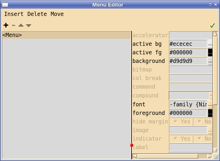
Use the arrow buttons or Move menu to move the selection up or down as desired.
To specify a cascade menu like File,
Select the <Menu> item at the top of the left field.
Insert->New Cascade.
Go to the label entry on the right and Enter File.
Use the arrow buttons or Move menu to move the selection up or down as desired.
To add Open to the File menu,
Select File on the left.
Insert->Command
Select “New Command”
Change its name as above.
Specify the command as above.
Move it up or down as desired.
Of course, you can add cascaded menus to cascaded menus, etc..
When you are all done hit the Check Button on the right.
The menu editing window is repeated below:
When adding entries to a cascade menu, that entry can be another cascade menu. See the reference to the example below.
When creating a menu, one can start by adding either commands which is most common case or a cascade menu which leads to a second level menu. Some documentation for menus bars say that one should only place cascade items in a menubar. However, I have found it useful and intuitive to have all kinds of items in the menu bar.
The Menu Editor allows one to change various colors of individual menu items as well as the fonts for individual items. Also one should be able to set preferences for default values of menu fonts and foreground and background colors. Preference processing does that. Default values for active foreground and active background are derived from the color selections for background and foreground.
When adding images to a menu and you have text as well, it is necessary to set the appropriate value in the compound attribute telling PAGE whether the image is to be on the left, right, top, bottom or center relative to the text. Again, while one can insert into the image entry field an image name, it is not recommended and the field has been colored orange as a warning.
menu.tcl is included in the examples subdirectory to illustrate some of the things that I have done to test the menu bar facility. Load it, generate the Python and execute it. I wrote the example to test the change in menu fonts and colors as well as having several images and several level of cascaded menus. I certainly do not advocate using weird images, colors and fonts all over the place. But you can.
I am uncertain about the best way to handle fonts in menus. PAGE now sets a variable that is used as the default menu font and that specification is forced everywhere in the menu that is not specified otherwise. However, once specified it is fixed. You cannot change it without re-specifying it everywhere it is used. I may revisit this issue.
The radio menu entry type has options “value” and “variable” which need attention. When a radio button is selected, the variable is set to value. That is, if variable is x and value is a then x is set to a, when the radio button is selected. The way the menu editor works is that when a radio entry is added to a menu, the label and value are set to “NewRadio” and the variable is set to “selectedButton”. If you wish to use the variable setting then you must change the variable to a different value, one you wish to use. PAGE will change create the correct Tkinter Variable Class of type string. It will also threat the value of the value field as a string constant. Change that field to a value that works with your application. Bare in mind that with radio entries in a menu they must all share a singe variable.
The Check menu entry type has options “onvalue”, “offvalue”, and “variable” much like radio entries. The main difference is that the check entry expects that each entry will have its own variable; they are not shared. Again, the PAGE implements the variables as StringVar objects and “onvalue” and “offvalue” as string constants. The variable stuff associated with menus can be bypassed by specifying distinct functions in the command options or by passing distinct parameters to the command function using the lambda function.
The Separator menu entry actually has a background option which is treated like the background entry of any other entry type.
Popup Callback Functions
While the callback functions are important for Menubars and Menubuttons, when defining Popup Menu Callback functions, you need to take a bit of extra consideration. Are you just going to be defining a Popup menu for use from a single widget or will you want to be able to use the Popup menu from multiple widgets?
The callback function definition is entered into the command text box in the Attributes editor. This is no different from defining the callback function for any other widget. A ‘normal’ callback function could look something like this…
on_mBarFileOpen
You can use this form for any widget that supports the command attribute. However, when dealing with Popup menus, you have the ability to use the same Popup Menu for many different widgets, like multiple Entry widgets. The problem doing this is, how do you easily let the callback function know which widget initiated the callback? We can use the lambda function to solve this.
lambda : on_popupCopy(args)
This works since the lambda call allows your code to send in additional parameters to the callback function. See Popup Menu Binding
Popup Menu Binding
The final topic to cover is the binding of popup menus to individual widgets. Popup menus are usually activated by mouse events bound to particular widgets. The Tk documentation discusses bindings of mouse events to widgets for different OS’s and PAGE attempts to follow those conventions. This is one of the above mentioned hacks. Note that a GUI toplevel may have more than one context menu and also more that one widget may be bound to a context menu. As an example of the latter, see Lib Demo, a photo album like example which displays a number of thumbnail images each of which can invoke the same popup menu.
Presumably almost any action of a widget can be bound to a popup menu. However, PAGE supports only the binding of <Button-3> events to a popup menu.
The preferred way to effect the binding of a popup menu to a widget is by means of the “Binding …” entry from the context editor for that widget. Some users prefer to set the binding from within the support module. In that case the code in the support module is like the following:
_w1.Entry1.bind("<Button-3>", lambda e: _w1.popup1(e, 1))
This code works for Unix like systems and Windows but does not follow the OSX conventions whereas the preferred way does. This binding method has the capability of binding events other than <Button-3> to a popup menu.
PAGE implements the callback functions for popups as module methods of the GUI module because these functions are generated by PAGE. Other callback functions are generated as skeletal functions in the support module. Callback functions for context menus and the menus themselves have default names. The context menus have default names like Popupmenu1, Popupmenu2, etc. and the associated callback function names are popup0, popup1, etc. The latter names should be reserved for popup callback functions. This is part of the hack mentioned in the last paragraph. However, they may be changed by altering the “function name” attribute in the Attribute Editor. Since the user is allowed to specify the function name of the popup function, PAGE requires that the event <Button-3> be reserved for popup menus; that is, do not bind <Button-3> to any other type of function. When popup menus are the result of copy-paste operations the function name may be different from what is expected. So check the function name in the Attribute Editor before specifying the binding.
The event object which is passed to the popup routine contains a wealth of information regarding the event that opened the menu, see event object. However, there are times when you want to pass a parameter from the GUI through the popup menu to a callback routine in the support module. This is how. The def statement for a popup menu in the generated support module looks like:
def popup1(self, event, *args, **kwargs):
so using the bind menu, one wants the Button-3 event to invoke the popup menu with something like in the GUI module:
self.Button1.bind('<Button-3>', lambda e: self.popup1(e,1))
using the binding menu:
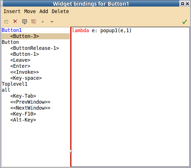
and set the command attribute in the popup menu to something like:
lambda:zzz(0)
The result is that when the widget Button1 is selected with <Button-3> the popup will appear and if the appropriate command is selected, then the function zzz will be called with the argument ‘0’. See Popup example ‘positional’.
If a popup menu is bound to a widget it is applicable for all subwidgets of that widget. So if you bind a popup menu to the toplevel widget and also bind another popup menu to a subwidget, say a button then selecting the button with <Button-3> in Linux, both menus will popup.
Menubutttons
Menubuttons are button widgets which when selected open a menu. There tk and ttk versions. Their appearance and behavior are very similar to simple button widgets. They have an indicator to distinguish the widget as a menubutton, Tk menubuttons have an option which to control the indicator.
There are several ways to create the associated menu - double clicking on the widget, using the widget submenu of the context menu, or selecting the menu option in the Attribute Editor.
The main missing function is the ability to copy-and-paste menubuttons. I hope to return to this issue for a future release.